Wednesday, May 30, 2007

91-92 Classic Draft Picks


Classic is one of many budget companies that existed in the early-90's. These companies either were not allowed to, or more likely, could not afford to pay for the rights to release NHL hockey cards, so instead they released sets like Classic's Draft Picks. Classic's inaugral draft set includes 50 of the top 62 draft picks from 1991 (most of the Russian and US College players are not inlcuded).

Of the four companies that released draft sets in 91-92, Classic is the only company that is licensed by the CHL (where most of the draft picks played), and the only company that was able to include the first pick from the '91 draft, Eric Lindros. Because it is licensed by the CHL, Classic could show most of the players in their actual junior uniforms while other companies had to airbrush the logos out. Some of the European players are only shown in blank jerseys, however.

Classic tried to create the illusion of value for this set by including 'Ceritification of Limited Edition', but my set is numbered 199,556 of 360,000, so I don't think they were really fooling anyone. Anyone who wants to pick up this 'limited edition' set can get one off of Ebay for less than $2.

For a budget set, Classic 91-92 Draft Picks has pretty good photography. A few cards are blurry or grainy, but most are as clear as anything in any NHL set.

This set also includes a bonus card (numbered 'B') of CFL'er Raghib 'Rocket' Ismail, a Los Angeles Raiders draft pick that was signed away from the NFL to the Toronto Argonauts for a ridiculous amount of money. He won a Grey Cup in his first year with the team, but got into trouble in his second year when he stomped on another player's helmeted head during a brawl.

Five of my favorites:
#15 - Glen Murray - I got to see Sudbury's opening game this year while I was on tour. They play in an old fire hazard of a building (built in 1951) and each time they score a goal, a taxidermic wolf on a pulley system flies across the ceiling above the opposing team's bench. The wolf looks like it's been there since the team's first season in 1962. My point is, Sudbury knows when they have a good thing going. Their logo is one of the best in all of the CHL because they haven't bothered changing it every few years like so many other teams.

#39 - Yanic Perreault - My favorite part of this draft set is getting to see all the old CHL logos. This one is the Trois-Rivières Draveurs. Apparently a draveur is a raftmen. I guess that could be a raft on the jersey?

#14 - Brent Bilodeau - Seattle still has the same logo, but they've changed the colour scheme from the old Hartford Whalers straight green, to the later Whalers navy blue, green and silver. It sucks.

#12 - Pat Peake - Probably the worst team name in CHL history: The Detriot Compuware Ambassadors.

#32 - Jeff Nelson - Right now the Prince Albert Raiders have a pretty boring pirate logo. I like their old 'Screaming Jihad' logo way better.

Friday, May 25, 2007

Topps vs. O-Pee-Chee


I always knew that Topps was the bullshit version of O-Pee-Chee. Those two companies always seemed to have the exact same set, except that Topps' cards were darker and grainier. Comparing these cards from 90-91, you can see how much brighter the O-Pee-Chee card on the right is than the Topps version on the left. It's even more obvious on the back. The only other noticeable difference is that the Topps card is not bilingual like the O-Pee-Chee card is.

In 1968 Topps teamed up with O-Pee-Chee to release an American version of the O-Pee-Chee hockey set. Topps had released sets on the their own for the ten or so years leading up to '68, but they usually only included cards from the four American teams in the original six. They obviously wanted a Canadian company to show them how to do it right. For the next 24 years, O-Pee-Chee and Topps would release parallel sets-- though for most seasons, Topps would release smaller sets.

While Topps hockey cards aren't nearly as valuable as their O-Pee-Chee counterparts, it's the opposite for baseball. In 1965, three years before they teamed up for hockey, O-Pee-Chee licensed a Canadian version of Topps' MLB cards. Just like Topps' did with hockey, O-Pee-Chee released a smaller set than their American partners. O-Pee-Chee's baseball cards aren't as valuable as Topps', but as far as I can tell, it's not because they are lower quality. Every Topps baseball card I own has the same grainy front, and dark back as their hockey cards do, while O-Pee-Chee is again clearer on the front and brighter on the back.

1991-92 was the last year of Topps and O-Pee-Chee's parallel sets. Topps released the same 528 card set as O-Pee-Chee that year and improved the quality by quite a bit. You can see on the cards beside that the Topps picture is only slightly darker, and the O-Pee-Chee back is just slightly brighter than the Topps back.

Overall O-Pee-Chee just released better cards. Everything about the cards was nicer from the feel to the small, classy logo in the corner of the O-Pee-Chee cards (or the sweet logo on the back of the 90-91 cards).

O-Pee-Chee stopped making cards after 92-93. The O-Pee-Chee brand name returned later after it was licensed by Topps. Following the NHL lock-out season, Upper Deck was awarded exclusive rights to make NHL trading cards. They have now purchased the rights to the O-Pee-Chee name and have used it to release an ugly 2006-07 set.

The Topps brand continued making cards until the 2003-04 hockey lock-out season when it lost the rights to make NHL hockey cards. They still make baseball, basketball, football and shitty novelty cards.

Sunday, May 20, 2007

91-92 Pro-Set Platinum Series II


Platinum was supposed to be Pro-Set's higher quality card. They do succeed somewhat, but they still have some lingering Pro-Set problems like putting the wrong player on a card (Chris Terreri on Craig Billington's card), and some poor cropping.

I really disliked this set as a kid. There are no names or team logos on the front of the card, the name on the back is written in handwriting and there are no stats at all. Overall, it is not a very kid friendly set, but now that I am older
I can appreciate the subtle details that make this set great at times, and hilariously awful at others.

Pro-Set made coach cards and referee cards in series two of their 90-91 set, and they had their cheesy "Play Smart" cards in their regular 91-92 set, but no company, Pro-Set or otherwise had a worse idea than Platinum's 'Celebrity Captains'. Burton Cummings (pictured left) is one of those 'Celebrity Captains'. Many of the rest are nearly as good. Just so I don't put these all in my favorites, I will list them here:
-James Belushi -Chicago Blackhawks - Star of K-9 and its straight to video sequel K-911.

-Fred Rogers - Pittsburgh Penguins - Yes, Mr. Rogers has a hockey card.

-Rick Hansen - Vancouver Canucks - I was always a little jealous that Pittsburgh got Mr. Rogers and the Canu
cks only got Rick Hansen.

-Larry King - Washington Capitals - Do you think Larry King has watched a hockey game in his life?

Five of my favorites:
#239 - Kirk McLean - The last of the great stand-up goalies. I couldn't ask for a better photo of my favorite goalie of all-time.

#288 - Chris Terreri - Terreri gets two pretty awesome photos in this set: one on his card and one on Craig Billington's.

#203 - Steve Thomas - Pretty nice horizontal action shot.

#216 - Brian Trottier - I really like action shots, but this card is so sparse that it is also rad.

#178 - Kay Whitmore - Most of the best cards in this set were either horizontal or goalie cards. Horizontal goalie cards combine the best of both.


Friday, May 18, 2007

Pro Set 91-92 Series I


I may have lost my original set of Pro-Set 91-92 Series I, but I managed to pull nearly the whole French Series I from my many boxes of random common cards. I'm not going to say too much about the set, you can read my comments below in the entry on Series II, but I did want to post my five favorites:

#186 - Tom Barrasso - This is a great photograph and probably the best card that Pro-Set ever made.

#5 - Cam Neely - Kick his ass, Sea Bass.

#65 - Dave Barr - You don't get too see many hits on hockey cards.

#176 - Ron Hextall - Kick saves and glove saves are my two favorite things to see on hockey cards.

#14 - Darrin Shannon - This guy's is getting held behind the net in his series two card as well.

Read my latest posts!

Tuesday, May 15, 2007

Pro Set 91-92 Series II


Pro-Set improved on a lot of things for the 91-92 set. Unlike their 90-91 sets, they used photographers who knew how to focus, they put the correct players on the cards, and they didn't give cards to any referees or coaches. Despite (or because of) all of this, I think the 91-92 sets just don't have the character of their predecessor. The design of the 91-92 cards is far too plain to be exciting. From the plain black name bar to the drab grey backs, these cards ooze out about as much excitement as a corporate meeting. Pro-Set tries to make things interesting with NHL history and Hall of Fame cards, but their choice of players, like Bernie Federko and Dale Tallon (at the time the set was released, neither were Hall of Famers) is odd and most the cards, maybe with the exception of the Boston Bruins pictorial history, are just plain boring.

Even Pro-Set's insert cards were plain as can be. Numbered CC1 through CC9, these cards looked almost exactly the same as the regular set. I didn't even know I owned any of these cards until a few days ago when I put all my Pro-Set cards in order. Compare
Adam Oates' insert card to Niklas Lidstrom's leader card. Not a lot of effort there.

I did own the first series of these cards when I was a kid. I'm not sure where that set went, but I can tell you that series one is more of the same-- just better players, and some all-star cards.

Five of my favorites:


#368 - Frank Musil - Look at this guy's face and make a joke in your head.

#470 -
Herb Raglan - Could he not get a proper visor in Quebec?

#478 -
Doug Wilson - There's something weird about seeing an old-school player like Doug Wilson, who had played since 1977 with the Chicago Blackhawks and was one the last NHLers to not wear a helmet, playing in a teal Sharks jersey.

#505 - Gino Odjick - Gino photographs well. I can't think of a single Odjick card that didn't get serious consideration as a top five favorite of its set.

#612, 614, 615 - Play Smart - Some of the worst cards of all time. Motivational messages like 'Get Involved,' 'Stay in School,' and 'Hockey is for Everyone,' are so bad they make kindergarten classroom posters blush.

Read my latest posts!

Tuesday, May 8, 2007

Score 91-92 Series II


Picking up exactly where they left off in the first series, with franchise players, prospects, and brothers, the only real difference in the second series is the blue borders. Like nearly all 'series II' sets from the early 90's, this set is made up of a lot of bums and unknown players that weren't good enough for the first series, plus a few stars who were traded after the first series was released.


Neil Sheehy is a good example of the kind of player that got a card in Score 91-92, Series II. After missing all of the 90-91 season with an injury, Sheehy played 35 games with the Calgary Flames (as well as 6 with the Salt Lake Golden Eagles of the IHL) managing all of three points (1 goal + 2 assists). He is quoted on the back of his card saying, "the game has given me everything I have. The only way anybody is going to get me out is by kicking me out." That was the last season Sheehy had in the NHL. He played parts of two seasons for Ljubljana in Slovenia before disappearing from professional hockey.

Five of my favorites:
#450 - Hubie McDonough - For some reason Score 91-92 had very few exciting action shots. This one is pretty good, except that this could just as easily be a Peter Ing card.

#554 - Brian Hayward - The Sharks were pretty exciting in their expansion year. The team was lousy, but the teal was hot! Hayward's mask was pretty rad too.

#372 - Patrick Roy (Dream Team) - Bad paintings are my favorite.

#385 - Dynamic Duo - I remember when this card used to be worth $1 back when I first got it. Rob Pearson never really panned out in the NHL. He played a total of 269 games with three different NHL teams before finishing his career with a few seasons in the IHL and one with the Frankfurt Lions of the DEL (Germany). Lindros is finishing off his career as a third liner for Dallas. Is this even worth a dime anymore? This painting, however, still rules.

#386 - A Look Into the Future - Hockey in space!


91-92 Score American


Americans got a slightly different set than Canadians. The main difference was purple borders instead of red or blue. The American set was one series of 440 cards, rather than two series' totalling 660 cards. Only the top 100 players had different photos than the Canadian cards.

Sunday, May 6, 2007

Score 91-92


Score gave it a good try, but their 91-92 set just doesn't stand up to their excellent 90-91 series. The diagonal red border works okay on the regular cards, but is very overpowering on the horizontal cards which were the company's strong point in the 90-91 set.

I guess that part of my problem with this, and most of the other 91-92 sets, is that there were just too many of these cards around. There were no shortages of the previous years' cards, but these cards, at the time, were easier to find than a Calgary Flames jersey at the Saddledome. I guess I lost a little enthusiasm when I started putting together my third complete set. By the time I finally stopped getting these cards as birthday presents I didn't even look at the cards in the pack-- I'd just open them and put them in a box. But I don't want to complain too much. It is still better than the uncollectible sets they have now.

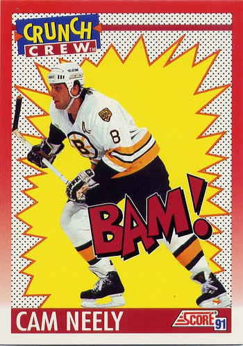
Anyway, Score 91-92 has most of the same content from the previous year, though they do add in some brothers, highlights, season leaders, the Crunch Crew, and a few Lafleur paintings just to make things interesting.

Five of my favorites:

#72 - Dave Gagner -It is well documented that Grant Fuhr was doing cocaine during the peak of Edmonton's dynasty in the mid-80's. I wonder if golf ball eyes here also needed an extra kick to get going. He mellowed out by the time they took his photo for the back.

#261 - Man of the Year - This card was pretty hot when it first came out.

#304 - Shark Attack! - I'd nominate this as one of the worst cards of all time. Another, even worse, look at the Sharks' sad roster mostly made up of career minor leaguers.

#312 - Wayne Gretzky Franchise - Gretzky could look pretty androgynous at times. Like when Andy Warhol painted him.

#307, 308, 309 - The Crunch Crew - They're all worth seeing.

Read my latest posts!