Showing posts with label Upper Deck. Show all posts

Tuesday, December 7, 2010

Worst Ever Hockey Cards #23

#67 - Mike Grier
97-98 Upper Deck
(back)

Get High on Hockey is back from the dead. . . for today. . . just because this card features three of my favourite things: an unflattering photo, pizza, and an ugly couch.

It's been a while since I've seen a suitably awful card, although I have been interested in old cigarette cards that are certainly awful and offensive. You really have to read the back of this 'Puppy Stew' card to understand what I mean.

Saturday, August 30, 2008

Hockey Card of the Day #37

Gilbert Dionne, Montreal Canadiens, 92-93 Upper Deck All-Rookie Team, hockey, hockey cards, douche#AR2 - Gilbert Dionne
92-93 Upper Deck All-Rookie Team

What a douche!

Monday, April 21, 2008

Hockey Card of the Day #33, 34

Rick Nash, Columbus Blue Jackets, 07-08 Upper Deck, Series 1 one 2 two, hockey, hockey cards(Left) #20 - Rick Nash
07-08 Upper Deck Series 1

(Right) #275 - Rick Nash
07-08 Upper Deck Series 2

Rick Nash walking on, and off, the ice! If you would like to see more photos of the Columbus Blue Jackets not playing hockey, you may also want to check out card numbers 271, 274, and 276. Just because no one cheers for Columbus doesn't mean you can be lazy, Upper Deck.

Sunday, April 13, 2008

Free box of Upper Deck!

07-08 Upper Deck, hockey, series 1 one, hobby boxIt's hard to believe that people would pay $72 for a box of these cards considering that the base set is worth nothing and most of the inserts aren't worth much more than that. I guess the point is to pull some exclusive hd-high gloss-parallel-autographed-game worn-rookie card and sell it on eBay for a pile of money. But if you don't get one of the few boxes that have those cards, then you're pretty much stuck with a pile of worthless cards. 07-08 is the new 91-92.

This box was free, so the price was right, and even though I already had the base set it was fun to open a box of hockey cards without the guilt of having spent a lot of money on it. One of the best things about this box was that out of the 192 cards in the box (24 eight-card packs) there wasn't a single double. Upper Deck was always the worst for that back in the 90's. The box of 93-94 Jumbo Packs that I opened recently was almost one-third duplicates, including quadruples of every Swede's favorite Belarusian, Alexander Andrijevski.

Out of my 192 cards, I got almost exactly what the box said I would: 172 base cards, including all the superstars like Sidney Crosby and Dan Cloutier; six Superstar insert cards, including Andrew Raycroft and Dwayne Roloson,'Hometown Heroes', Ryan Miller and Jarome Iginla, 'NHL's Best', Phil Kessel 'Award Winners' (the Masteron trophy is tied with the Lady Byng for lamest award in my books), and Scott Niedermayer's 'Lord Stanley's Heroes' card where it looks like he had to clip the bird shit out of his disgusting homeless-man beard; six Young Guns rookie cards-- I got some pretty marginal 'guns' in this batch-- Matt Niskanen, Ryan Callahan, David Krejci, Jared Boll, Daniel Winnik and Curtis McElhinney; Mark Stuart and David Legwand Game Jersey cards, and probably the only card actually worth more than a buck-- the 'Signature Sensations' Martin St.Louis autograph.

By my estimation, these cards are worth, at most, $35 if sold individually, which means I would have lost about $40 if I had purchased the box and was looking for a profit. I wish that Upper Deck would at least put enough cards in the box so you have the chance of getting the full base set when you buy a box. For $72 it's the least they could do, especially since it would only take one more card per pack.

All of these cards are up for trade. Make me offers of Pro-Set t-shirts, as well as weird and terrible hockey cards.

Wednesday, March 5, 2008

Hockey Card of the Day #31, 32

Jonathan Cheechoo, San Jose Sharks, 07-08 Upper Deck, Series 2 two, hockey, hockey cards
#326 - Jonathan Cheechoo
07-08 Upper Deck Series 2

San Jose vs. San Jose? Bullshit! They had half a season to get a photo of Cheechoo and they the use one from the team's intra-squad game.


Pascal Leclaire, Columbus Blue Jackets, Upper Deck 07-08 series 2 two, hockey, hockey card
#271 - Pascal Leclaire
07-08 Upper Deck Series 2

Why is it that Schwarzenneger gets to be in all the best hockey villain movie scenes?


Sunday, February 17, 2008

Hockey Card of the Day #28

Alexander Andrijevski, Chicago Blackhawks, Upper Deck 93-94, hockey, hockey cards#26 - Alexander Andrijevski
93-94 Upper Deck
(back)

I bought a box of 93-94 Upper Deck Jumbo Packs because I remembered that jumbo packs ruled when I was a kid. I didn't get any Wayne Gretzky cards, but I did get four Alexander Andrijevski's. Luckily, I needed this card for my collection of worthless and forgotten hockey players.

Thursday, February 7, 2008

Hockey Card of the Day #26

Adam Graves, Edmonton Oilers, 90-91 Upper Deck, hockey, hockey card#344 - Adam Graves
90-91 Upper Deck
(front)

Some guys grow playoff beards, Graves grew a playoff scumstache.

Tuesday, February 5, 2008

04-05 Upper Deck All-World

Henrik Zetterberg, Timra IK, Swedish Elite League, Detroit Red Wings, 04-05 Upper Deck, All-World hockey, hockey cards
I'm not sure why, but I really appreciate ugly and ridiculous hockey cards. Maybe it is because while everyone chases down the latest hot rookie card, I can be just as happy with a bottom of the barrel common card that makes me laugh (and saves me a lot of money). This is why Upper Deck's NHL lock-out year All-World set gets two thumbs up from me.

The set's 90 base cards mostly feature NHL players with their European teams, with a few former European-NHL stars thrown in as well. There are a lot of stars included in the set, but the real star of this set is the garish jerseys these guys are wearing-- some of which would even make race car drivers weep. Among the worst offenders are the Swiss National League's, SC Bern and Zug; the Czech Extraliga's HC Zlin and Pardubice (it is nice to see Kappa clothing on someone who is not trying to sell drugs to me at the bus stop) and Finnish SM-Liiga's Jokerit Helsinki (though to be fair this photo is from the 94-95 lock-out, not that it makes that collar any less ridiculous).

I know that European teams make most of their money from sponsorships, which explains why it looks like they have the yellow pages printed on their jerseys, but surprisingly the team with the highest payroll in Europe during the lock-out, Ak Bars Kazan of the Russian Super League, also had the best jerseys. These jerseys wouldn't even be bad for the NHL. It is definitely better than what Anaheim wears.

Five of my favourites:

#27 - Nikolai Khabibulin - Does he always look like this?

#44 - Borje Salming - This photo seems like it would have been from Salming's pre-NHL days, right? But all of his stats that I have found say that he only played for AIK Solna in the early-90's. Could they not afford good cameras, or is something wrong? European readers please let me know.

#55 - Hakaan Loob - He's missing his nice purple bow tie.

#78 - Joe Thornton - The best of the few action shots.

#87 - Igor Larionov - A classic jersey that will make you wish for the days of pre-capitalist European hockey.

Thursday, January 24, 2008

07-08 Upper Deck Series 1

Dustin Penner, Anaheim Ducks, Edmonton Oilers, 07-08, Upper Deck, hockey, hockey cardsI don't feel like this set really needs a big write-up. All you really need to know is that there aren't nearly as many exciting action shots as the previous year's set, I don't like the skinny little bar at the bottom/side of the cards, but it is still a lot better than the new O-Pee-Chee set which is once again ugly. 07-08 Upper Deck is above average, but below great.

Five of my favourites:

#54 - Joe Sakic - Overhead shots are always stand-outs.

#79 - Steve Bernier - There should have been more cards like this.

#128
- Martin Biron - The one improvement over the previous year's set is the goalie cards. There are a lot more horizontal action shots, which are always the best.

#131 - Simon Gagne - I just noticed that all but one of the cards I pulled from the set as potential favourites are horizontal cards. They should just make the whole set like this.

#147 - Chris Phillips - I always like when I can see what the player is doing in the context of the play.

Friday, January 4, 2008

94-95 Be a Player

Doug Gilmour, Toronto Maple Leafs, 94-95 Be A Player, Upper Deck, hockey, hockey cardSo far on my blog I've covered some pretty awful sets, like the infamous 90-91 Pro-Set, which featured errors, referees and the puck; Sunkist's riculous 05-06 'orange peel' set with it's horribly photoshopped jerseys; Pro-Set Platinum's 91-92 second series which, most notably, features cards of children's entertainer, Fred (Mr.) Rogers and CNN douche, Larry King; as well as numerous low-budget draft pick and major junior sets that really scraped the bottom of the barrel of good taste and basic competency. But all these sets pale in comparison to the set that I am naming the official Worst Set of All-Time: 94-95 Be A Player.

Be A Player, which was produced by the Upper Deck and the NHLPA, was kind of a big deal back when it was first released because it was the first set to include an autographed card in every pack. Hopefully, the excitement of finding an autographed card was enough to off-set the disappointment of finding out that the set was not licensed by the NHL, meaning that none of the players were shown wearing their team's jersey. When the players are shown playing hockey (which isn't as often as you'd expect in a set of hockey cards) they are wearing a variety of ugly NHLPA jerseys, and when they aren't playing hockey, you find some of the worst hockey cards in existence.

The set can be divided into ten different, but all terrible, sub-sets:
  1. Hockey players being hockey players - This includes the few action shots, the many posing in hockey equipment shots, and the poorly airbrushed uniform shots.
  2. Hockey players being golfers - Golfing might be fun, but it isn't very cool. No one collects golf cards, and no one should have ever made cards of hockey players golfing.
  3. Hockey players being models - Half of this set looks like a NHLPA clothing catalog.
  4. Hockey players being themselves - This is one of my favourite parts of the set because I get to see how professional hockey players are just like regular people: they like playing pool, rollerblading (note that this is from the same photo shoot as his 91-92 Upper Deck card), dogs, being gay, impersonating Kenny G, and arson!
  5. Hockey players giving tips - The boring part of the set.
  6. Hockey player snapshots - There's shots of 14 NHL stars or up-and-comers,Pavel Bure, Fanimation, Vancouver Canucks, 94-95 Be A Player, Upper Deck, hockey, hockey card and then, for some reason, Garry Valk.
  7. Hockey players as kids - You get to guess who the person is from their childhood photo. I guessed Cammie Granato on this one, but it was actually this guy.
  8. Denis Leary talking about hockey players - You remember him? The guy who had that comedy song 'Asshole'. He makes some 'PG ' jokes on some players' cards.
  9. Hockey players in the news - I always hate these cheesy fake newspaper things. It usually means that their are too many words and not enough action, but this card makes up for it on the back-- a player playing real hockey!
  10. Hockey players as fanimated superheros - Try to imagine the worst thing you could possibly put on a hockey card. This is worse.
I could have put almost all of the 180 cards from this set into my Worst Cards of All-Time list, but I've narrowed it down to these five inductees:

#34
- Jason Arnott - I snuck into these waterslides at the West Edmonton Mall once when I was on a band trip. I'm a little disappointed I didn't get a photo on a trading card.

#62
- Steve Smith - Too bad Steve isn't as good at golf as he is at scoring in his own net in the 1986 playoffs.

#141
- Denis Leary - It's sad that a comedian is one of the few people shown playing hockey in this set.

#174
- Curtis Joseph - Touching his balls!

#178
- Eric Lindros - I always wondered what Eric Lindros would look like as a pimp from the year 3000. Not that he was a bad dresser back in the 90's though.

Tuesday, January 1, 2008

06-07 Fleer

Joe Thornton, San Jose Sharks, 06-07 Fleer, Upper Deck, hockey, hockey cardsIt doesn't seem like Upper Deck is going to be releasing a Fleer set this year, which is too bad considering this was the second best set of 06-07, in my opinion (which is the correct opinion). I already said just about everything I have to say about this set in a previous post, but since I got the set off of eBay for next to nothing, I thought it deserved it's own post.

Upper Deck should have released these cards as their O-Pee-Chee set instead of the ugly brown cards that got the O-Pee-Chee brand name. Everything about the Fleer set is closer to the traditional look and feel of the O-Pee-Chee sets of the past except that the backs only have stats from the player's last five NHL season stats.

Five of my favourites:

#45 - Nikolai Khabibulin - Judging from what I can see of his face through his mask, he must be the world's ugliest dude.

#94 - Rob Blake - Since this was one of the first sets of the 07-08 season there weren't photos of some of the players with their current teams, so they either used a photo of the player with his previous team and put the current team's logo in the corner, or, in Rob Blake's case, they hired a handicapped person to hold up his new jersey for a photo.

#114
- Scott Hartnall - As much as I liked Nashville's gaudy third jerseys, it's about time they were put out of the NHL's misery.

#125 - Trent Hunter - This guy looks like he was drafted from the dark corner of one of those internet cafe's where you see people playing war games online 24 hours a day.

#154
- Sidney Crosby - Ever heard of him?

Tuesday, December 11, 2007

95-96 Collector's Choice - You Crash the Game

Bernie Nicholls, Alexei Zhamnov, 95-96 Collector's Choice, You Crash the Game, Chicago Blackhawks, Winnipeg Jets, hockey cards
I remember these inserts being really exciting back when they first came out. If the player scored on the date listed on the front of the card, you could send it in (with $3 postage) and get the full 30 card You Crash the Game redemption set. The set had the same photos and design as the cards you sent in, but instead of the ugly purple and teal border, the redemption cards had either silver or gold foil bars that said "Silver Set" or "Gold Set" really large so that you knew what colour it was. In addition to the 30 card set, you got two bonus cards which were the same as the regular card, except the background was tinted gold and the bar on the left side of the card said "Bonus Card" so that you knew that it was not part of the regular set.

Pavel Bure, Paul Coffey, 95-96 Collector's Choice, You Crash the Game, Detroit Red Wings, Vancouver Canucks, hockey cardsThe backs of the cards were a little different, the redemption cards (the ones you sent in) just had the contest rules and skill-testing question, while the redemption set (the cards you got back) had a very poorly thought out double spaced blurb about the player. The silver, gold, and bonus cards all had the exact same backs.

I probably should have just kept the winning cards I pulled from the packs and saved myself the postage; the full 30 card You Crash the Game Set recently did not get a single bid at $3.99 on eBay.

Sunday, December 2, 2007

Hockey Card of the Day #16

Norm Maciver, Ottawa Senators, Team Point Leader, Upper Deck, 93-94, hockey card#299 - Norm Maciver (Team Point Leader)
93-94 Upper Deck

This is the saddest team leader card I've ever seen. I think it would have been nicer if Upper Deck had just listed the team's most inspirational player, or most improved player rather than showing that the team's plus/minus leader was a minus-16 and the team's wins leader had just eight of them.
Upper Deck, 93-94, Ottawa Senators, Team Leaders, back

Sunday, November 25, 2007

95-96 Upper Deck Collector's Choice

Eric Lacroix, Los Angeles Kings, Upper Deck, 95-96, Collector's Choice, hockey, hockey cardsThe foil lettering and full-bleed photos on 95-96 Upper Deck cards meant that regular Upper Deck was out of my price range, so I collected the second best Upper Deck set. 95-96 Collector's Choice is actually more like the Upper Deck sets of the early-90's than the regular Upper Deck set: it has a simple white and gray border and action photos on both the front and back. The size of the photo of on the back depends on how long the player had been playing in the NHL: since Blaine Lacher had just finished his rookie season, you get to see a nice large photo of him doing the splits in his boxer shorts, but since Gretzky had just finished his 16th NHL season, you only get to see a thumbnail sized photo. For some the cards it is hard to understand why they chose to put the less exciting photo on the front when they have pretty awesome photos on the back.

Since the regular Upper Deck set already included all the World Junior Championship player cards, and you couldn't have a set in the mid-90's without some kind of international junior tournament, Collector's Choice made cards for the European Junior Championships, a tournament that no one in North American had noticed before or has cared about since. The set only includes the Finnish and Swedish teams, but even with two of the stronger European hockey countries, there are very few notable players, with Vesa Toskala probably the best of the bunch. The set finished off with some ugly 'What's Your Game?' cards that explain to the lay-hockey fan the roles of various players such as scorers and grinders.

Five of my favorites:

#8 - Gary Suter - It always looks like Suter's face is melting off.

#168
- Keith Tkachuk - Kirk McLean is obviously making another highlight reel save.

#281 - Brent Gretzky - Tampa Bay was a pretty terrible team for its first few years in the league, but at least they knew how to get some easy publicity: first they put Manon Rheaume in net for a few minutes in a couple of pre-season games, then they drafted Wayne's lesser brother, Brent.

#129
- Brett Lindros - Doesn't this photo just warm your heart?

#326
- Mikko Markkanen - I can't figure out why a player would have a duffel bag on the ice at any time for any reason.

Tuesday, October 23, 2007

Hockey Card of the Day #2

Steve Yzerman, Detroit Red Wings, Upper Deck, 90-91, hockey, hockey cards, nhl, hologram NNO - Steve Yzerman
90-91 Upper Deck Hologram Stickers
Worst Ever Hockey Card Set #1

Usually when you look at these holograms you just have to take Upper Deck's word that there's a hockey player somewhere in the blur. But today I found out something exciting: if you hold the card at just the right angle, with perfect lighting (indirect light that's not too dark or too bright) and then close one eye and squint with the other, you can not only see the number on the player's arm clearly enough to positively identify him as Steve Yzerman, but you can see another player behind Yzerman who I think may be Brett Hull! And to think that Upper Deck was considering pulling these cards from production for lack of quality!

Tuesday, October 16, 2007

06-07 Upper Deck

Kari Lehtonen, Atlanta Thrashers, Upper Deck, 06-07, nhl, hockey, hockey card, goalieI took my own advice from my post on 06-07 cards and bought the complete set of Upper Deck (both series') for $10. For some reason the rookies aren't counted as base cards even though they are numbered as part of the set, so I received cards 1 to 200 and 250 to 450. Having seen all the cards in the set now, I still think it's the best set of the year, and perhaps the last several years, but it's still far from a perfect set.

One of my biggest problems is the inappropriate use of the word 'score' in the blurbs on the backs of several cards. I'll use Brian Gionta's card as an example: ". . . his 24 power-play scores set a team record." Was that written by a four year old? Do the people at Upper Deck also say that a team won "three scores to two"? Probably not. Scoring is the action, goals are the results.

Other than Upper Deck's poor grammar, the first series is quite amazing. There are more action shots than I've seen in any other set, including net battles, body checks, slapshots, saves and goals. The second series, however, feels a lot more thrown together. Upper Deck would have had to move fast to get all the photos of players on their new teams in time to release the set before the season was over, and the quality suffers for it. Instead of action shots there are a lot more photos of guys just skating around, not doing much and goalies stretching. The lamest thing Upper Deck did was to include two Gretzky cards. It's not like these were special cards celebrating some special achievement, one is a checklist which might not have been too big of a deal, but the other is a regular card just like every other one in the set, except that the last stats shown are for the 98-99 season. Adding a retired superstar like that just so you can put his picture on the box and sell a few extra to people who don't know anything about hockey is the lamest gimmick I've seen since the terrible pre-NHL Eric Lindros cards in 91-92 Score.

Five of my favourites:

#32 - Darren McCarty - Two minutes for stupid facial hair and generally acting like a jackass.

#45 - Nikolai Khabibulin - This is a nice horizontal card with an interesting angle showing a glove save, but the real reason I like it is that it is the closest Anson Carter got to having a card. I know Carter didn't do much in Columbus or Carolina and he's out of a job now, but if his 33 goal season with Vancouver didn't earn him a card, didn't his hair?

#98 - Derek Boogaard - I read in an old Beckett that the NHLPA doesn't allow companies to use photos of players fighting. I think that's stupid. They can show goalies making saves, and players scoring, why can't they show fighters fighting? Look at this card-- they don't even give Boogaard a stick when he plays. He just runs around elbowing guys until someone fights him.

#104 - Andrei Markov - Frank Musil's little brother?

#181 - Mats Sundin - Living in Vancouver, where you can barely afford to sniff the air around GM Place when the Canucks are playing, it's hard to believe that in other NHL cities the seats are as empty as this.

You can watch a guy open a box of 06-07 Upper Deck on an internet show called Rip & Pull. I don't suggest it. It's just a chubby nerd opening packs of cards, but I wanted to point that out so I could post the video of a later episode where he gets a stripper named Dejah Vu to help him open a box of basketball cards. It's as embarrassing as it is depressing.


Read my latest posts!

Tuesday, September 25, 2007

92-93 Upper Deck

Ron Francis, Pittsburgh Penguins, Upper Deck, 92-93, nhl, hockey, hockey cards
With 640 cards between the high and low series', Upper Deck didn't leave anything out if it's 92-93 set. On top of the base cards that cover everyone from Wayne Gretzky to Grigori Panteleev, the set includes painted team checklists (though they aren't as striking as the ones in the 90-91 set), brothers (this time the Linden's are on roller blades instead of the Bure's), the '92 Finnish World Junior team, Russian stars, '92 World Hockey and '93 World Junior Championship cards, trophy winners, young guns, lethal lines, and more.

Of all the sub-sets, my favorite is the Rookie Report where hockey experts predict that Pat Falloon "has many 50-goal seasons ahead of him (he only managed two 50-point seasons in his disappointing career)," and that Tom Draper will be Buffalo's goalie of the future, while Dominik Hasek is merely "unpredictable" and "fun to watch (Hasek took Draper's spot in Buffalo in the 92-93 season)." An honorable mention goes to the player profiles that fill-out the last twenty cards of the set. There's nothing like reading boring answers to generic questions and looking at the sweet shoes that Jaromir Jagr wears, or Doug Gilmour trying to be a badass and talking about riding his "hawg." What a dink. I only wish that on Brian Bellows' profile they would have shown him holding his own hockey card.

With all those sub-sets, Upper Deck could have easily done a half-assed job of the base cards, but once again they made a classy design. The borders are simple and much smaller than the previous year leaving more room for exciting action shots-- and there are lots of them. For many sets it's tough to pick five cards that stand-out from the rest of the pack, but for this set I had to cut it down from at least 25 very good cards.

So here they are, five of my favourites:

#181 - Bob Bassen - There is so much to take in on this card. The crowd's reaction is an interesting as the defender's.

#177 - Brian Propp - Getting tripped on the front, and getting tripped on the back.

#338 - Igor Korolev - The guy with the mustache isn't allowed to sign autographs for kids under 18.

#263 - Petr Nedved - Upper Deck's photographer in Los Angeles loves that fisheye lens.

#497 - Tomas Jelinek - You need to see the back of this card to fully appreciate why Tomas Jelinek is the Lanny McDonald of unibrows.

Monday, September 24, 2007

05-06 Sunkist

Lanny McDonald, Toronto Maple Leafs, Upper Deck, sunkist, 05-06, nhl, hockey, hockey cards
Sets this bad don't get released every day. I'd expect that most ideas that are as terrible as this get nixed long before they find themselves being bent and creased in five-pound bags of oranges. But somehow, this Sunkist/Upper Deck NHL alumni set managed to squeak through to production without anyone stopping and saying, "these cards blow."

I don't even know where to begin with this set. Maybe I'll start by pointing out that the ugly orange border on the front of the card is actually the outside of an orange, and the back of the card has the inside of an orange as the background; the logos are all photoshopped out (which is always lame), and in the case of the Richard Brodeur card, you can still see the outline of the 'V' from the Canucks 80's 'flying V' logo; only four of the six players featured in the set could really be called stars-- as good as Wendel Clark and Richard Brodeur were at times in their career, they are far from hall-of-fame quality; the back of the card has more information about fruits and vegetables than it does about the player on the card; the cards are included in a bag of oranges!

I'd have to say the one redeeming thing about this set is the sweet Sunkist logo in the bottom right corner. If Sunkist made a set that was just fruits and vegetables playing hockey I'd be so stoked I wouldn't know what to do with myself.

Here are the three remaining cards from the set that I haven't already posted:

#3 - Yvan Cournoyer
#4 - Doug Gilmour - The only player not shown in the colours of a Canadian hockey team.
#5 - Dale Hawerchuk

06-07 Sunkist
Markus Naslund, Vancouver Canucks, Upper Deck, sunkist, 06-07, nhl, hockey, hockey cards
If I gave an award for most improved set, Upper Deck/Sunkist would get it for their follow-up to the worst set ever produced. The back of the cards still has that ugly orange background, and more information about fruits and vegetables than the players, and the cards are still horribly cut, but other than that, the cards look pretty good. Of course, it helps that for '07, Sunkist shelled out for licensing from both the NHL and NHLPA so they could show current players and not have to photoshop out the team's logo. It's also helps that they decided against putting the same orange border on the front of the cards that they did the previous year because the ice background is actually appropriate. Unfortunately, the cards are still included in five-pound bags of oranges, so the chances of finding one that isn't bent in six different directions are slim.

Here are all ten 06-07 Sunkist cards:

#1
- Alex Kovalev
#2
- Jason Spezza
#3
- Mats Sundin
#4
- Jarome Iginla
#5
- Ryan Smyth
#6
- Marcus Naslund
#7
- Alexander Ovechkin
#8
- Vincent Lecavalier
#9
- Joe Thornton
#10
- Miikka Kiprusoff

Wednesday, September 12, 2007

06-07 Hockey Card Round-Up

By my count, Upper Deck released 30 different sets for the 06-07 season. Since I don't have the time or money to buy and write about each set, I am only going to cover the four affordable sets that I could find.

Upper Deck
Cost: $4/8 card pack

Easily the best set of the year. A nice simple, classy design plus lots of horizontal cards (five in my pack of eight cards) and lots of action shots. Probably my favorite set in the last ten years. Of course, like everything Upper Deck releases now, there are more subsets, inserts and game worn memorabilia cards than there are base cards. While that does make collecting the complete set from the pack difficult, it seems that there are lots of people who don't even want the base cards-- meaning you can buy the complete set off of eBay for about $10.

Best card from my pack: #143 - Robert Esche (back)

Fleer
Cost: $2/10 card pack

The more I look at and feel these cards, the more I like them. Fleer has that great rough cardboardy texture that I thought was extinct from hockey cards. While the photography in this set isn't particularly exciting, the cards aren't boring to look at either, and the fact that this set reminds me more of O-Pee-Chee than Upper Deck's O-Pee-Chee set earns it several bonus points. This is the closest anyone has gotten to the budget cards of the early-90's in a long time. Add five more cards to the packs, get rid of most of the inserts and drop the price of the full case to around $30, and this is a ten out of ten in my books.

Best card from my pack: #56 - Sergei Fedorov (back)

O-Pee-Chee
Cost: $1.50-2/6 card pack

Upper Deck really messed this one up. They took the most important brand in hockey card history, and instead of giving it a classic design deserving of its name, they farted out an ugly brown border and stamped the O-Pee-Chee logo on it five times bigger than it needed to be. I know that O-Pee-Chee's last set (92-93) was bad, but why did Upper Deck have to try to up the ante on ugly? The photography does manage to follow in the tradition of O-Pee-Chee cards: lots of close-up non-action shots. It's just too bad that that was the only point that they could get right. I suppose they did also make a simple, two colour back, but it's simple to the point of laziness. I can't think of any sets with backs that are more boring than this brown quadruple-spaced turd. They couldn't even be bothered to put in the right headings for the goalie stats. Pretty lame!

Best card from my packs: #419 - Vesa Toskala (back)

Victory
Cost: $2/6 card pack

I guess Upper Deck put all their effort into thinking of thousands of uncollectable subsets, so their actual sets were just thrown together when they needed something to package with their inserts. Victory is an uninspired set that looks like a second rate Score. Everything about these cards is unspectacular. Why is it necessary to have the big Victory logo behind the player when the logo is in the top left corner anyway?

Best card from my pack: #91 - Alexander Frolov (back)

Tuesday, April 17, 2007

Hockey Cards Rule

O-Pee-Chee, 90-91, pack, hockey cards

Hockey cards rule. Who didn’t love the feeling of tearing the waxy wrapping off a brand new pack of cards? Trying to peel the gum off that Russian card without ruining it was part of the fun.

The early 90’s were the glory years for hockey cards—they were affordable, they were awesome, and they were everywhere. What really made these cards great was how simple, yet exciting, they were. With the exception of O-Pee-Chee’s Red Army mini-set (there was one Russian card per pack) and Upper Deck’s poorly made five card hologram set (the red blur was Yzerman, the grayish blur was Gretzky), there were no inserts. That meant that if you bought a full case of packs, you had a pretty good chance of putting together the full set—goons, bums, geezers and all. They didn’t have autographed platinum-die-cut-game-worn-jersey cards, they had blurry, off-centered cards that were totally awesome.

Unfortunately for some, these cards haven’t appreciated in value much in the 16 years since they first came out. I guess since every kid in Canada had them, there isn’t much demand for them now. Fortunately for me, this means people are willing to sell these sets for next to nothing. So I’ve been buying them.

Here's what rules about each set:
Jeremy Roenick, Chicago Blackhawks, O-Pee-Chee, 90-91, hockey cards
O-Pee-Chee 90-91

O-Pee-Chee had the advantage of being the only hockey card company for about thirty years leading up to the 90’s. They pretty consistently put out awesome sets, and the 90-91 set was no exception. With 528 cards, O-Pee-Chee covers every player you remember and many more that you don’t. They even managed to squeeze in all the players from the two Russian clubs that played against NHL teams in the 89-90 season. Although you could complain that this set focused too much on close-up shots of the players and not enough on action, the classic design with the hockey stick and team colours on the front and the simple two colour backs makes this one of my favorite sets of all-time.


Five of my favorites:

#190 - Winnipeg Jets - I’m a sucker for horizontal cards. I like switching from full screen to wide screen for those exciting action shots. Goalies and the older Jets logo are two other things I like. There are too many good things about this card to mention them all.

#69 – Neely - Cam Neely is a badass. He rules while taking a slapshot, and ruled as Sea Bass in the movie Dumb & Dumber

#501 – Arturs Irbe - It looks like Irbe's pads were orange at some point but got covered in tar. Bonus points for spelling his name wrong.

#42 - Alexander Mogilny - He looks like one of those really awkward, greasy kids from high school that would play magic cards in the science room at lunch.

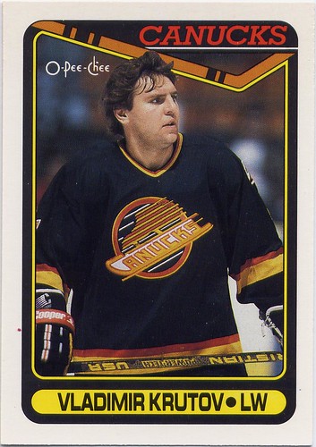
#308 - Vladimir Krutov - Krutov was a big fat bum for the Canucks. This card shows it.

Trevor Linden, Score, 90-91, Vancouver Canucks, hockey card

Score 90-91

It’s hard to say for sure, but I think that this Score set was my favorite as a kid. The cards weren’t dirt cheap like Pro-Set, but they weren’t totally out of range like Upper Deck, and they had way more action than any other set. When you’re a kid, you don’t want close-ups of guys sitting on the bench, you want guys blasting slapshots. Score has lots of that.

Score’s design is simple but great: the team, a couple of red and blue stripes, and a little silhouette that is supposed to help you understand what position they play (but doesn’t) is all you need. The rest of the card is filled with some of the best photography you’ll see in an early 90’s set. Score doesn’t have all the bums and Russians that O-Pee-Chee has, but they make up for with some sweet draft pick and all-star team cards.


Five of my favorites:

#1 – Wayne Gretzky – Score starts the set off right with the best Gretzky card of the year.

#300 – Brett Hull – There are more horizontal cards in this set than any other set I’ve seen. This is probably the best. Nice photo of Hull on the back too.

#218 – Zarley Zalapski - I’ve always loved this card—not because he has a funny name, or because this card is horizontal when it doesn’t really need to be, but because Pittsburgh had such a great home jersey that year.

#304 – Mark Tinordi - This guy is just trying to go out there and really set the tone.

#68 – Mike Liut - Rules.

Upper Deck 90-91Larry Robinson, Los Angeles Kings, Upper Deck, 90-91, hockey cards

I like all the 90-91 sets. There’s something awesome about every single one, but Upper Deck is the crème de la crème of 90-91 hockey cards.

These were the cards I always wanted but could never afford. Upper Deck was the first company to put that fine glossy finish on the cards that made them look so vibrant and exciting. The first series of the Upper Deck 90-91 has just 400 car
ds, the fewest of the major sets that year, but they make the most of it. It’s hard to find a single card that won’t make you so stoked that you’ll wish it was 1990 all over again.

Score is the only other card to have photography anywhere near as cool as Upper Deck’s. I really can’t decide which one I like better: Score has more horizontal action shots, while Upper Deck has cooler angles and lenses. This set also features the most bizarre team checklists you will ever see.

Five of my favorites:
#10 – Rick Wamsley – Glove saves make for great cards.

#46 – Mike Modano - Look at the guy in the background. He’s stoked.

#302 – Vancouver Canucks Checklist – These checklist paintings are so bad. I don’t know if the artist was trying to make Petri Skriko look androgynous, but at least he’s not in space.

#135 – Bruce Hoffort – This was one of my favorite cards as a kid. I got a trivia question about Philadelphia goalies at the Hockey Hall of Fame correct because of this card. Boo-Yah!

#95 – John Tonelli – Goal! The back of this card has a nice shot of the seats in the old North Stars
arena.

Pro-Set, 90-91, discount

Pro-Set 90-91

Pro-Set was the poor kid's hockey card. Often off-centered, out of focus, or poorly cropped, you got what you paid for. As bad as they were, these cards are still very nostalgic for me. This was the first set I ever collected. I can still remember getting five packs of Pro-Set hockey cards for my fifth birthday. I was so excited when I got this Gretzky card.

For all the set's faults, I still like it's design. Though it is notDaren Puppa, Buffalo Sabres, Pro-set, 90-91, hockey cards as classy as Upper Deck, O-Pee-Chee or Score, Pro-Set keeps things simple: the logo, player name, and team colours. Other parts don't seem quite as well thought out-- an obstructive yellow bar informing us of a recent trade, and pink backs on Detroit Red Wing cards.

Five of my favorites:

#99 - Dave Babych - Babych's play had dropped off considerably by the time he came to the Canucks in 91-92, but his mustache was consistantly great.

#225 - Rick Tocchet - Many of the cards in this set are very dark. On this card it works.

#250 - Guy Lafleur - As a kid, I never understood why Guy Lafleur would came out of retirement to play for a team as bad as Quebec. Now I do-- they have nice jerseys.

#176 - Patrik Sundstrom - Another thing Pro-Set did was put the wrong player on cards. Here they have Peter Stastny on Sundstrom's card. You wouldn't think it would be too much of a problem since you can see most of Stastny's name on his jersey. They made up for it by putting Sundstrom on Stastny's card.

#72 - Glen Hanlon - Goalies from the late 80's, early 90's looked so fragile. Hanlon looks like he can barely stand up.

Cliff Ronning, St. Louis Blues, Pro-Set, 90-91, series 2, hockey cards

Pro-Set 90-91 Series II

Pro-Set really scraped the bottom of the barrel for the second series of their 90-91 cards. The majority of the set is made up of bums that weren't good enough to get cards in the first series. They throw in a few decent rookies, and stars who were traded just before or during the 90-91 season to make the set somewhat interesting to the casual hockey fan, but sink to extreme lows with their coach and referee cards. I wonder who was in charge of that decision? What hockey fan really cares about the refs and linesmen enough to want to collect their cards?

Five cards:

#527 - Harold Snepsts - It's hard to argue with a mustache like that.

#580 - Pittsburgh Penguins Team Card - This set had some pretty ugly team cards as well.

#703 - The 2000th Point - This Gretzky card was hot shit when I was in kindergarten.

#705 - The Puck - "And remember, when you're at an NHL game, watch the puck!" In case you didn't notice, this set was made by Americans.

#704 - Stanley Cup Champions - Why are the Oilers in space? It at least made a little sense with the North Stars.

Read my latest posts!